CSS Grid
CSS Grid is quite simple, you just declare display: grid in a parent container and then declare which pattern you want. Usually with grid-template-columns or grid-template-rows. You can specify the values in any unit possible, however, if you need to resize it based on size, I usually do like this.
.container {
	display: grid;
	grid-template-columns: repeat(auto-fill, minmax(300px, 1fr));
}
In this case, the minimum with is 300px, meaning no container will be smaller than that, else, all elements will take up 1fr, or 1 fraction of the space.
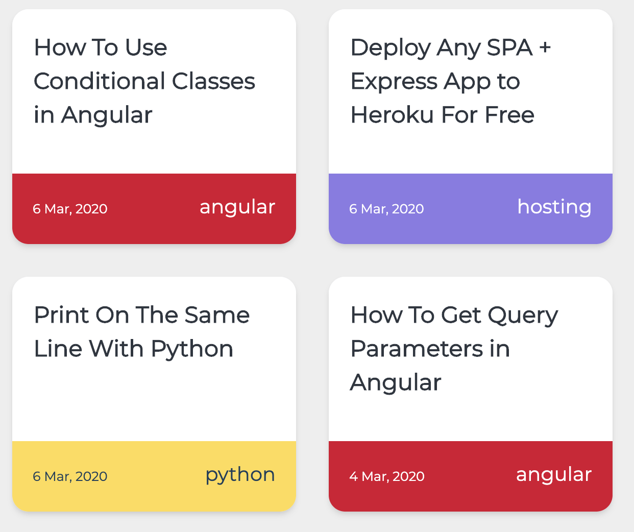
In my case, this is on a bigger screen:
And this is on a phone screen: